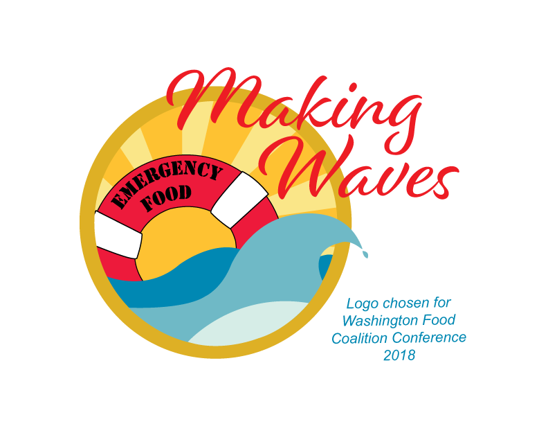
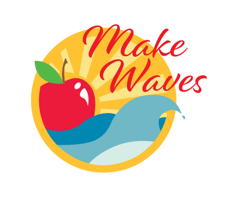
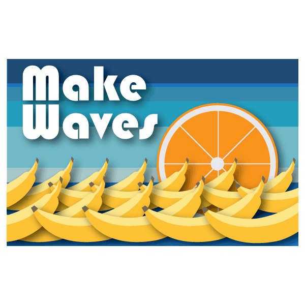
Washington Food Coalition 2018 Conference Logo
Making Waves
I designed several logo options for the WA State Food Coalition Conference in September 2018, one of which was selected as the conference logo. The client requested a name change for the logo from "Make Waves" to "Making Waves", and that the apple in the original logo be replaced by a life preserver with the words "Emergency Food". Here I've included two of my original submissions, as well as the final result.
Contest Award Winner
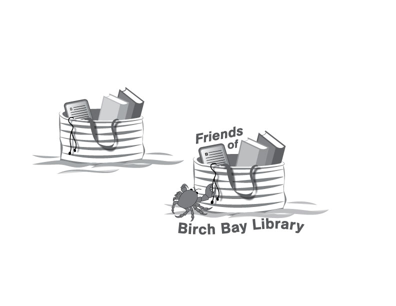
Friends of Birch Bay Library Logo
The Friends of Birch Bay Library (FOBBL) held a logo contest in April 2018 and chose this logo to represent their organization. We worked collaboratively to make changes to include digital media aspects, and to add a playful touch with the crab.
Since the crab added extra complexity to the piece, FOBBL chose to use the crab version on larger materials such as book plates, book markers, and posters. The small version without the crab will be used on business cards and letterhead. To learn more about FOBBL's worthy cause, check out their facebook page at https://www.facebook.com/FOBBLibrary/
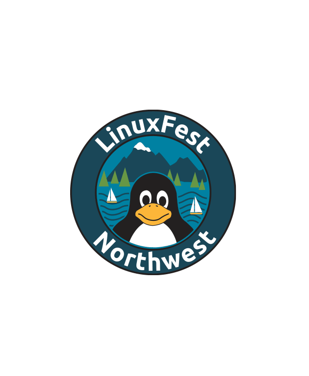
Bellingham Linux User Group & LinuxFest Northwest Logos
The Bellingham Linux User Group (BLUG) had been operating for many years without a logo, and decided it was time to visually establish their brand. Because this is a tech-focused group, the design is clean and uses a sans-serif font. The thin blue waves and floating letters are a reference to the group's location on the coast.
LinuxFest Northwest is an annual conference co-hosted by BLUG. In celebration of the conference's 20th anniversary, the group decided to re-vamp the logo. Tux, the penguin mascot for Linux, had to be the main feature. The mountains and water background represents the area where the conference is held. The Tux image was designed by me, based on the original artwork by Larry Ewing.
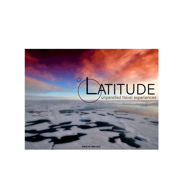
Latitude E-Magazine Logo & Cover
This logo was designed for a travel e-magazine. The intended look and feel was one of modern sophistication aimed at well-traveled individuals looking for extraordinary new experiences. I chose a sans-serif font with a clean look and high x-height. The title of the magazine in small-caps works well with the tagline in lower-case. The large circle represents the earth, and the small circle represents degrees latitude. Regardless of whether the viewer notices the symbolism, the circles visually complement the vertical and horizontal nature of the typography.
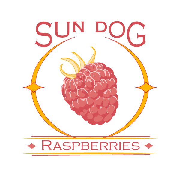
Sun Dog Raspberries
This is a 2 spot-color logo designed to represent Sun Dog Raspberries. A sun dog is halo-like flare that can sometimes be seen around the sun. The challenge was to create a logo that appealed to its customers with juicy, ripe raspberries while capturing the sun dog concept. This logo has a feel reminiscent of images seen on old fruit crates.
North Sound Youth Symphony
The North Sound Youth Symphony was seeking a fresh design in celebration of their 25th anniversary, and my design was chosen.
I wanted to depict different children in silhouette to represent all the young musicians who have performed with NSYS over the years. Because this is a youth symphony, I chose bright colors to emphasize the instruments.
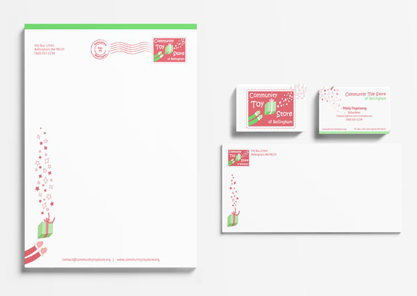
Community Toy Store
Community Toy Store is a local non-profit organization that provides low-income families with the ability to purchase Christmas gifts for their children at a fraction of the cost. Although they have been in the community for several years, they did not have a logo. They are expanding to other areas within Whatcom County and wanted to establish a logo to help promote the organization and retain cohesiveness among the different branches.
I designed this logo and the accompanying business cards, letterhead, and envelopes. This was a runner-up in consideration of more than 20 logos. If you're interested in learning more about the Community Toy Store, please visit their website here.