Logo Process Example: Sun Dog Raspberries
Research
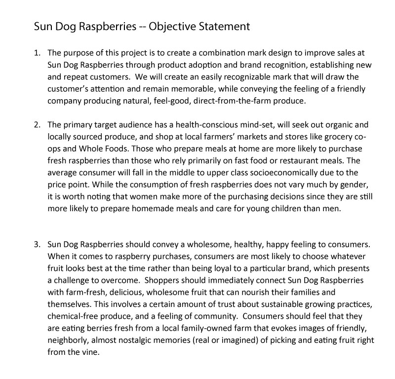
This was approached as a new logo development (as opposed to a re-branding project). Once I understood the requirements I launched into the research step and produced an objectives statement outlining the purpose of the logo, the image the company wished to convey, and the target audience information.
Imagine & Create
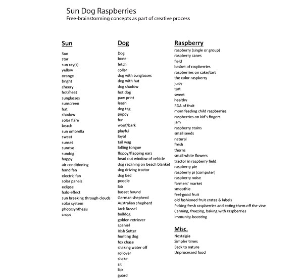
After gathering information and performing the necessary research, I made a list of brainstormed concepts related to the project. This was a very rough process... clearly many of these concepts would never be used but sometimes a few bad concepts lead to some gems.
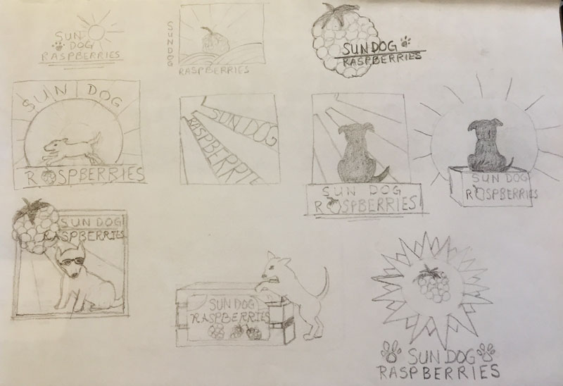
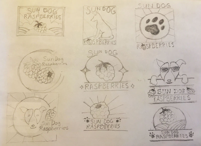
Then I made some quick, very rough pencil sketches of ideas to be evaluated by the client. After first narrowing it down to 3 images, it was eventually decided to go with the image in the center of the middle page. Sometimes, clients choose aspects from two or more sketches to be combined to form a new image.
Refine
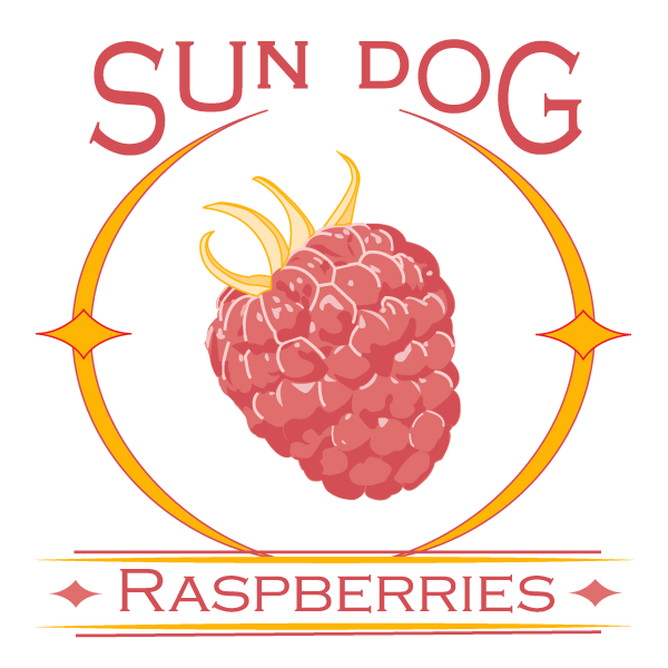
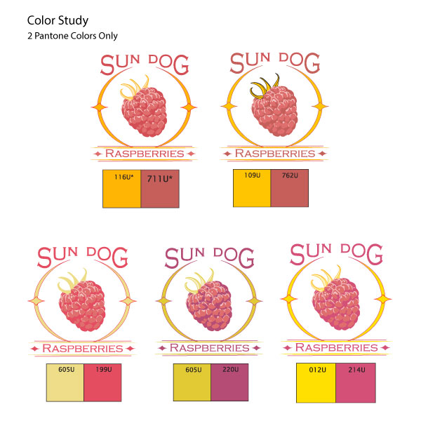
I created a digital mock-up of the chosen sketch. The next step was palette choice. In this case, it was necessary for this logo to be limited to two Pantone colors as a cost-saving measure. One color to represent the red raspberry was a given. The second color was a little more tricky as it would have to be suitable for both the yellow sun dog flare and the normally green leaves on the raspberry, hence the experimentation with yellow-green hues.
Deliver
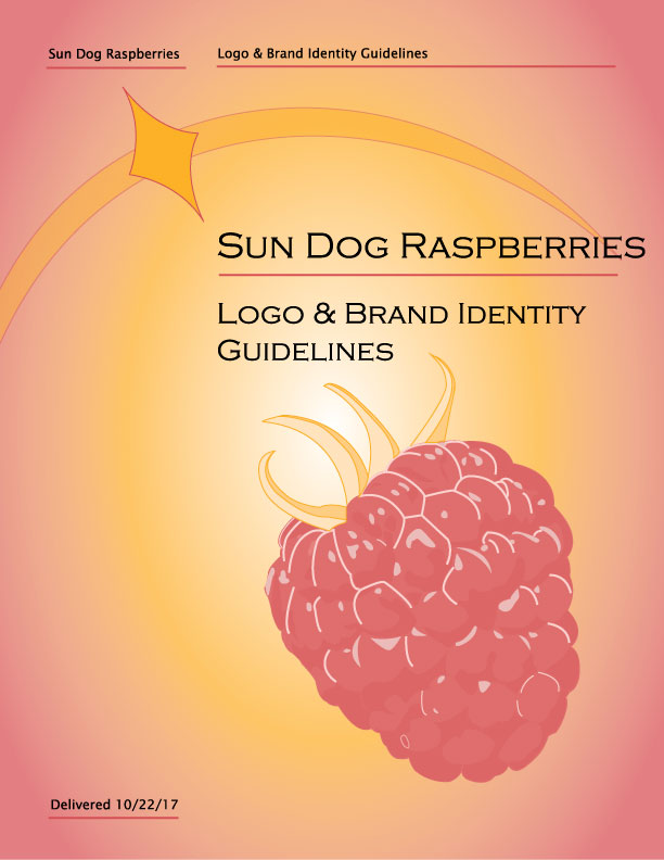
Once the design was complete, I delivered native Adobe Illustrator and .pdf files for the logo both in color and optimized grayscale. Printing a color logo on a black and white printer can result in a washed-out appearance. To avoid this, I created a grayscale version with the contrast adjusted to make the image pop. In addition to the images, I generated a set of logo & brand identity guidelines the company could use in the future to ensure cohesion throughout all of their marketing initiatives. Click here to view the interior pages of the branding guide.
