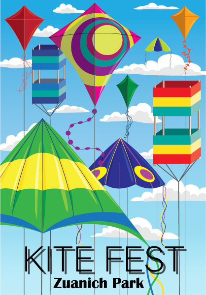
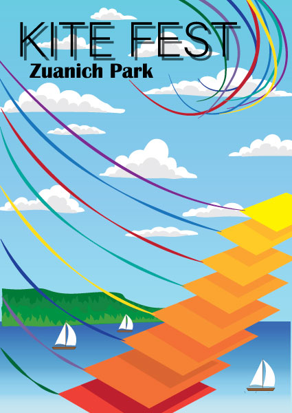
Kite Fest Posters
These two posters were designed to advertise a kite festival event. The goal was to create 2 completely different designs that retained the look and feel of a set meant to advertise the same event. This was accomplished by using a shared color theme and fonts, and small similarities such as the cloud style.
Core Learning Ability Posters
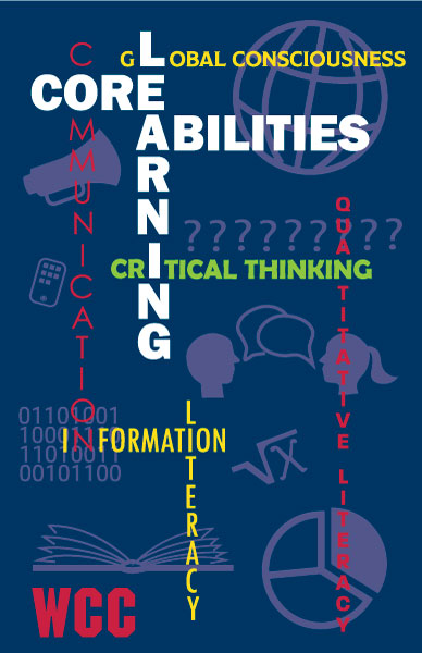
Whatcom Community College was looking to replace a current poster design depicting their 5 core learning a abilities. These posters hang in every classroom and many other areas throughout the campus, so were highly visible. The posters must display the title "Core Learning Abilities" and the five individual abilities clearly.
I approached this from different perspectives as this poster had to be approved by top levels of WCC's administration, the staff, and have the support of the students. The three posters below show my different approaches, all of which had a similar concept underpinning the design. With limited text allowed, I chose to reinforce the core learning abilities with representative icons. Because the client wanted the text to shine, everything else in the posters was designed to support the text.
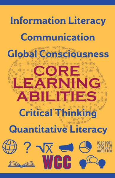
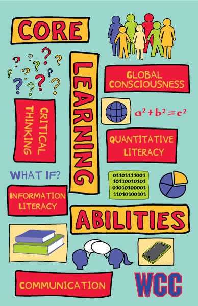
This poster is the most straightforward and collegiate of the set. It can be read and understood at a glance, but the trade off is that there wasn't much to intrigue the viewer and remain memorable.
This poster is laid out in a crossword fashion with rich colors. The icons are placed behind the text throughout the poster in a slightly lighter shade of the background... evident but not distracting.
I created this poster by hand-illustrating on a digital tablet. The idea was to create an interesting, colorful poster that would catch and retain the interest of students. Since more than 65% of the student population are millenials, I researched marketing practices for that demographic and used the information to produce this poster. In a student survey asking students to weigh in on the poster designs, this poster was the overwhelming winner.
North Sound Youth Symphony
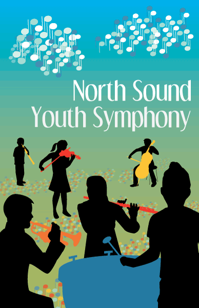
This poster was chosen by the North Sound Youth Symphony as part of a competition to design artwork celebrating their 25th anniversary.
Design considerations: I chose to depict children as silhouettes to allow them to represent all the participants over the last 25 years at varying ages and ethnicity. The brightly colored instruments stand out against the black silhouettes. Musical notes were used to represent the rain clouds that so often dot our sky, and the flowers in the fields.
LinuxFest Northwest T-Shirts
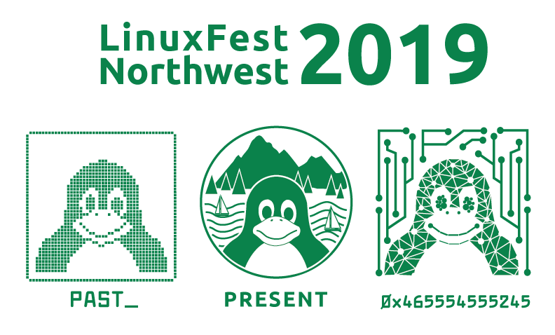
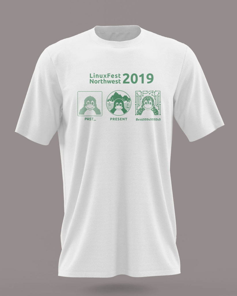
These T-shirts were developed for the 2018 and 2019 LFNW conferences. All designs had to feature the Linux mascot, a penguin named Tux, in a single color. The 2019 conference theme was "Past, Present, Future". I designed three versions of Tux to represent these concepts. The Present representation is the current, newly-minted LFNW logo. The past is a pixelated image of Tux as one might have seen on early PC's. The future image is an AI version of Tux with the word "Future" written in ASCII code.
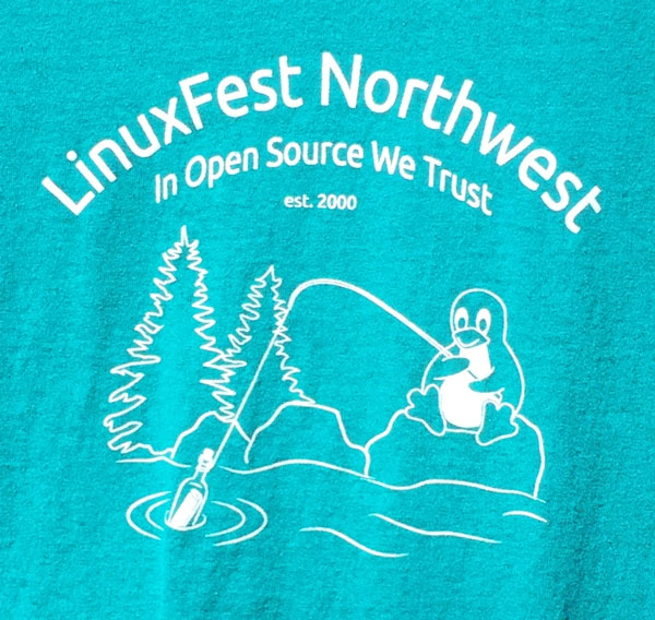
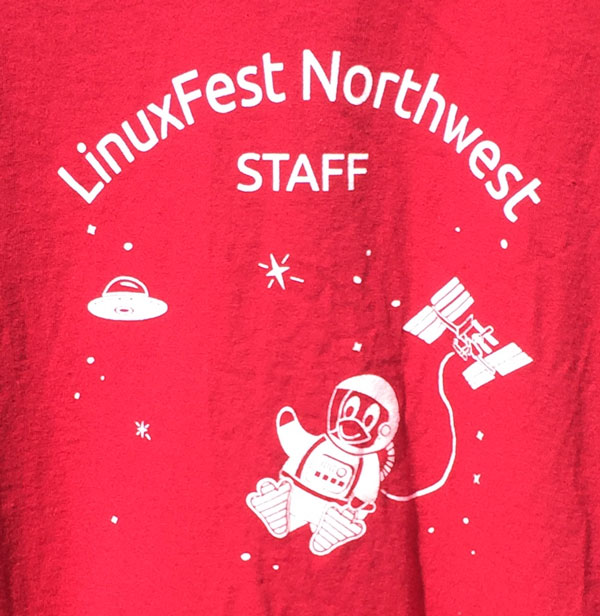
I created two t-shirts for the LinuxFest Northwest Conference 2018, one for participants and one for staff. The theme of the conference was "Message in a Bottle". Again, both shirts had to feature Tux the penguin. The staff t-shirt had to be red, and depict a space scene per their conference traditions. The participant shirt design had to portray Tux engaging in a Pacific Northwest activity incorporating the conference theme. These depict my original artwork based on the original Tux character created by Larry Ewing.
Dragtopia Event Advertising Posters
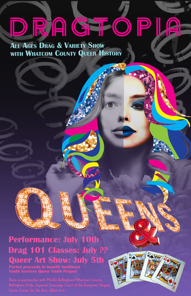
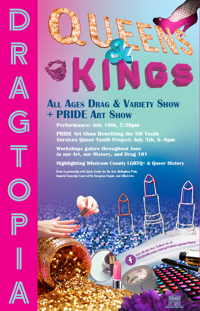
These two posters were developed for a local all-ages drag and variety show event.
City Star
This is a whimsical illustration I enjoyed creating just for fun. An imaginary city-scape took shape organically while I played with some of the new Adobe Illustrator features.
